Guillaume Belhomme (Gypsophile) and Emmanuel Lamour (Shop) originally collaborated to produce this album in 1998, which commingles opposing aesthetics: Gypsophile, at this point in his career, representing the classical (chanson française, bossa nova, romance); Shop representing irreverence (cheap electronic pop, garage technology, chaos). The album saw a limited self-release as a CDR in 1998. Guillaume and Manu had a subsequent falling out, the result being that when Manu approached RK in 2001 with a remastered/remixed/expanded version of the album, Guillaume initially refused to allow the album to be re-released. The “versus” in the name had been prophetic.
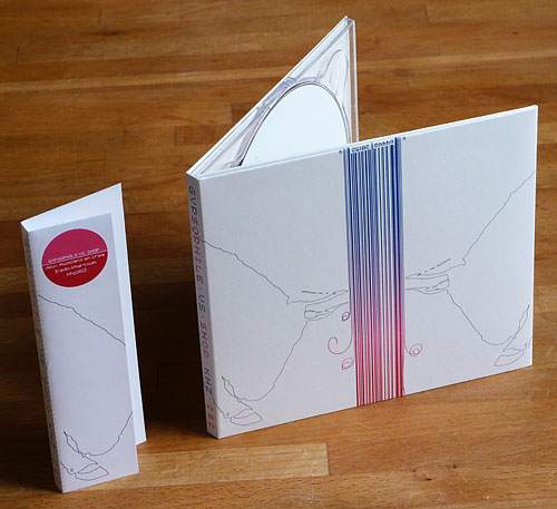
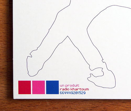
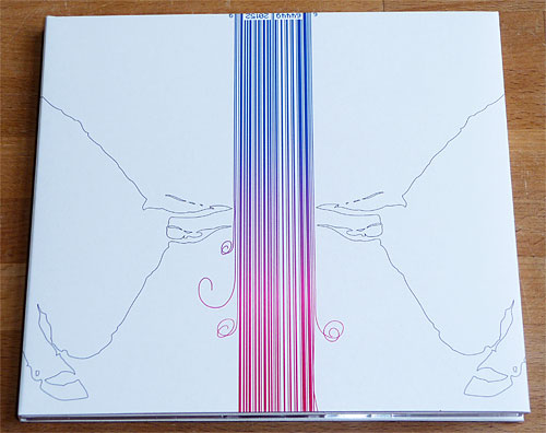
The charging bulls are computer line art (good old Adobe Streamline), and we were too cheap to color in the details.
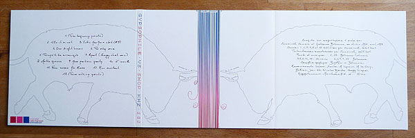
The palette: “bruised bubblegum”
Flip the cover over, and we discover that the bulls are connected by their tails after all.
The first functional barcode on an RK release. The top uses enough cyan for scanners but the lines unravel at the bottom.
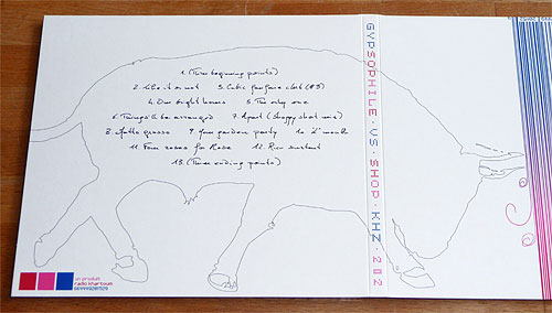
Guillaume was late to adopt email, and for a few years the arrival of his letters was a joy: his handwriting was fabulous! Of course, deciphering his script was part of the charm. I had Guillaume write out all of the titles and credits, and then I cut and pasted to arrange them (sometimes swapping one instance of a letter for another to improve legibility). Some day I would love to create a typeface based on Gypso-script.
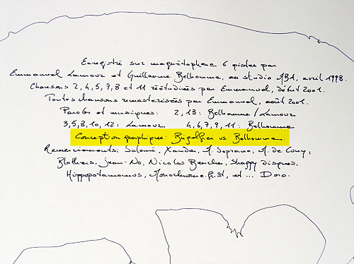
Conception graphique: Bügelfrei vs. Belhomme
The Bügelfrei design credit played off the versus theme (and it should be mentioned here that a photo of a matador sent by Guillaume was the inspiration for the twin bulls).
Manu’s hand (and universal legibility) are represented by a pixel font on the obi. In the same stroke we also satisfy record shop display interests by getting the artist and title onto the front of the package.

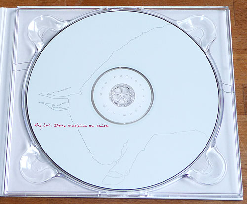
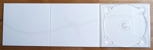
More of Guillaume’s hand going through the bull’s sight-line (seeing red), and more pixel font for the website address, rendered as drop-out text at the center of the disc (easiest to see when the disc is held in front of a light source).